Wednesday 17 December 2008

 
close up of eye with photomanipulation to intensify light/dark- sepia tones and colour adjustments- textural as well as portraiture?
Photomanipulation- I gave myself wings!

Rankin Analysis

[im00223.jpg]
Rankin, "Obsessive Behaviour" , Dazed & Confused magazine, Nov '96

1. what are the photographers aims?
To portray Robbie as the 'cheeky chappy' that he is by putting him on the front of some girl's knickers. 
2. Who is the image for? More than one audience?
I think it is for fans of Robbie and for himself as well as the photographer who has been able to keep his signature 'white background' while displaying the humorous side of the subject. 
3. Does the image successfully communicate the photographers aims and intentions? 
Yes, it is a striking image and can be seen as humorous

Analysing the image.
1. What type of photography is this? documentary, reportage, portrait, fine art, advertising, editorial?
Advertising..? But in an artistic way.
2. What is included in the photograph?
A belly button, girl's knickers, Robbie's face
3. What message does it convey? 
That Robbie is a humorous character which is visible from the expression he is pulling and the way he has been placed in the photo
4. What techniques do you think have been used to make the image?
Careful lighting/ positioning of the model and Photoshop touch ups
5. Has the image been staged?
Definitely
6. Has the image been manipulated in any way?
Possibly, it is difficult to tell whether the photo on the knickers has been printed on or taken separately and added in photoshop

Personal Response.
1. How does the image make you feel? 
It is a humorous picture, not particularly emotive but it did catch my eye because it is a striking image
2. Does it remind you of anything? personal experiences, other photographers work.
It reminds me of the days of the week underwear that many children had growing up... perhaps this is another idea behind the photograph?

Thursday 20 November 2008

MAGNUM


Elliot Erwitt


Photographers intentions.

1. What are the photographers aims?

To provoke emotions in those who see this image. To maybe make them feel how he felt at the time?

2. Who is the image for? More than one audience?

Anyone who has ever been in love- no specific audience really in terms of age, sex etc.

3. Does the image successfully communicate the photographers aims and intentions?

Yes, it is a very striking photo and is cleverly done.


Analysing the image.

1. What type of photography is this? Documentary, reportage, portrait, fine art, advertising, editorial?

Fine art maybe? I'm not sure, it's designed to make you feel something I think. Emotive photography?

2. What is included in the photograph?

The background is visible and it looks like the sea shore with a sunset. There is the wing mirror with the reflection of the 2 people and the side of the car.

3. What message does it convey?

It's young love- they look truly happy to be in one another's company and maybe feel like they are breaking a few rules as they are parked in a remote area watching the sunset and having a bit of a snuggle in the car.

4. What techniques do you think have been used to make the image?

The composition is very important in this photo as a lot of time and attention has been paid to try and get the reflections just right. Also, timing must have been important to catch the sun at that moment where it was bouncing off the water.

5. Has the image been staged?

Possibly, but it has been made to look spontaneous. I would imagine that the composition took a while to get right and several shots.

6. Has the image been manipulated in any way?

No...


Personal Response.

1. How does the image make you feel?

Happy :) It is a lovely image and makes you feel all warm and fuzzy inside...

2. Does it remind you of anything? Personal experiences, other photographers work...

Well everyone's had a moment like that, haven't they? Time stands still and it's all perfect etc... It reminds me a bit of Ted Suzalski's work on street photography- He has captured many moments like this, sometimes by accident. For example:


Edits & What-Not


I really liked this photo of Laura because of its general composition and the way her red hair
contrasted with the green trees around her. I decided to intensify these two colours and make
the contrast even more obvious and then I put a border around the image to make it more tidy. I did a black and white version as well which worked well but some of her features are more difficult to see. However, it is still a skriking photo.


I didn't like this photo very much as it is dark and blurred. I decided to try and lighten the image which made it look worse and distorted some of the colours so I then opted for a two-tonal modification which made the image much more striking as it is just plain black and white.

Wednesday 22 October 2008

HIDDEN ALPHABET!


Took me ages. Done all on trains/train stations between Southend East and Fenchurch St. Putting them next to each other made them look more like a set and I particularly like the 'G' and the 'W'.

Monday 6 October 2008

More Depth of Field & Textures


These are some pictures which I took while I was in Canterbury. I experimented with depth of field and I think the berries look quite effective in the last shot. I also found a really big, old tree which had an interestingly textured bark.

Wednesday 1 October 2008

Portrait

The first photo is a portrait shot from the waist up. The model is looking natural (because I made her laugh).
The picture below is a closer shot of just her shoulders and her head which is posed.

Saturday 27 September 2008

Depth of Field


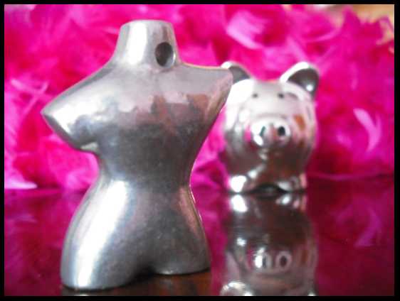
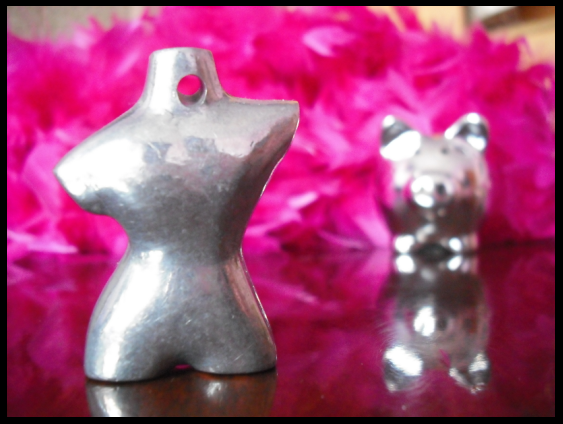
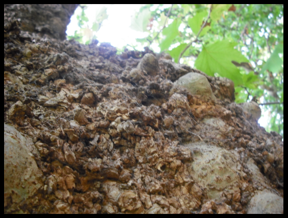
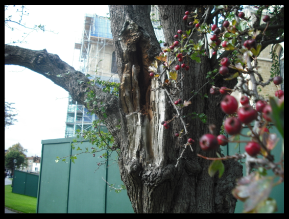
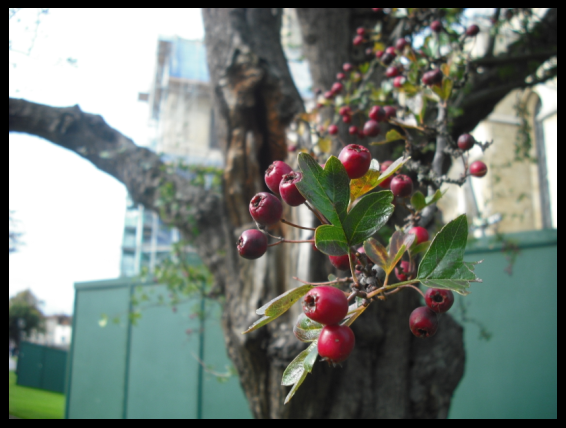
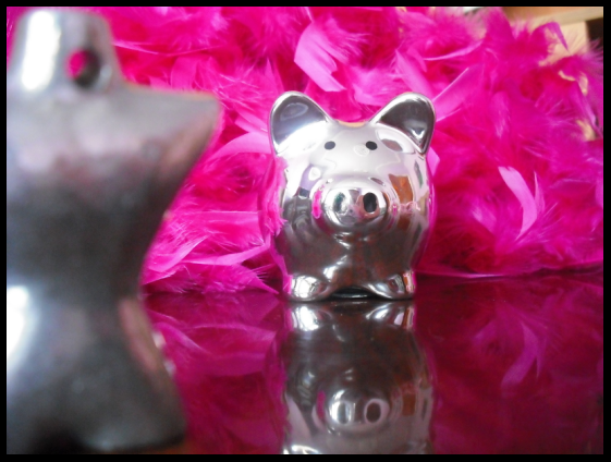
These are some basic shots experimenting with depth of field. The objects are purposefully laid out to emphasise the differences in focus.


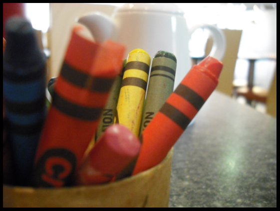
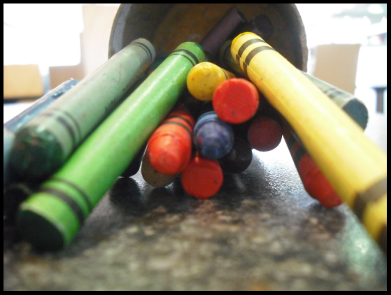
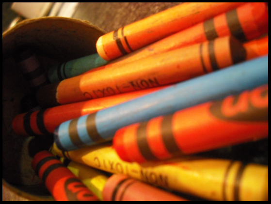
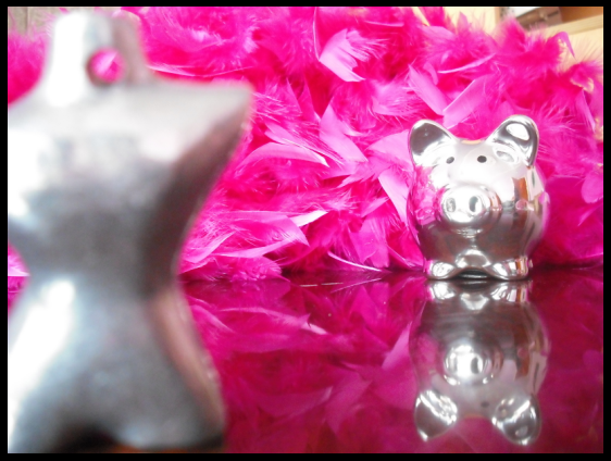
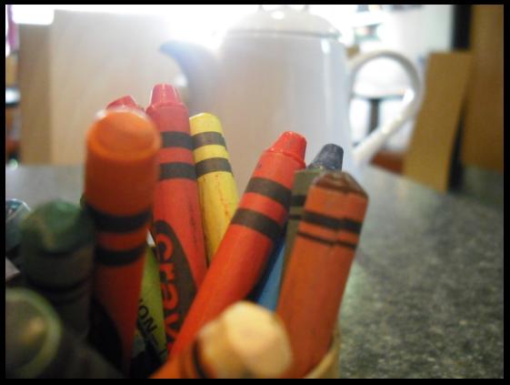
Here I have used crayons to experiment with the depth of the photos. I particularlylike the second one as it is a clear shot which is composed well.